Darnell Cottage "Quaran-tour" : Kitchen Remodel (with alllll the details, sources & more)!
It’s hard to believe we started our “Quaran-tour” of the Darnell Cottage 6 weeks ago!
We are excited to continue showing you the rest of our home and we are especially excited about this next room - the largest transformation in our home…. the kitchen! Who doesn’t love a good kitchen remodel?
You don’t want to miss out on this because we are sharing all the details (links below)!
2015 Renovation Process |
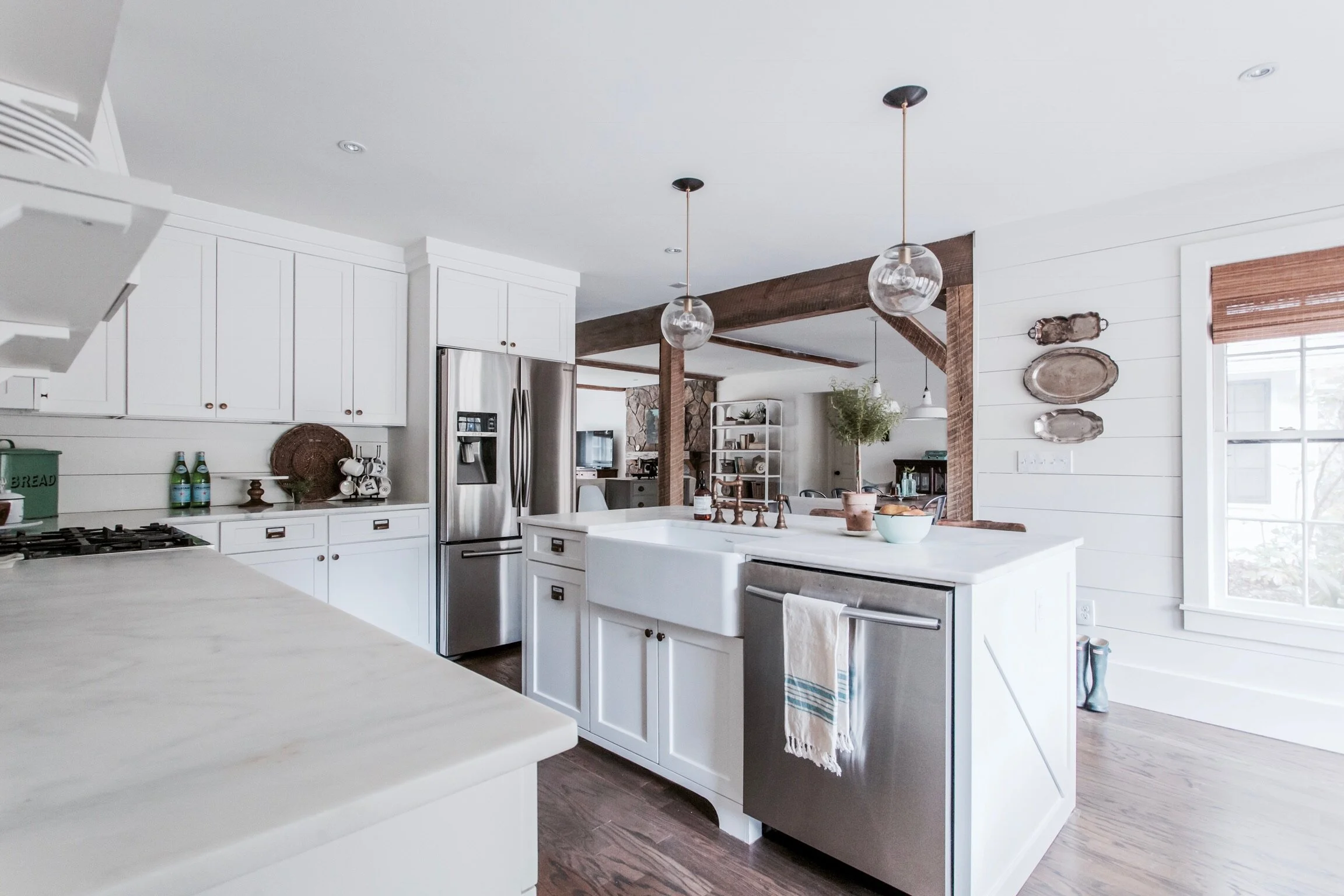
Like we shared last week, we removed the hallway that led from the foyer to the kitchen, which opened the kitchen up to the dining room. This was huge because, as you can see, it gave us views from the kitchen to the dining and living room.
But, we didn’t stop there. The biggest layout change we made was flipping the island. Previously the island was facing away from the living and dining areas, so we situated it so when I was at the sink, I could see the girls in the other rooms.
Other than that, we kept the same perimeter cabinet layout and didn’t move appliances (this is a huge cost savings!). But, we did get all new custom cabinetry with shaker doors. Our cabinets are full overlay (which is usually a more cost effective option) and we painted them BM White Dove!
A couple other important changes to note:
We removed the microwave over the stove and added custom hood. In my opinion, this is a must for all kitchen renovations. It doesn’t have to be a large hood, but it is a game changer - adding character and making it feel custom.
We also knocked out the uppers to the left of the stove and added open shelving. I love this and would totally do it again. We place our everyday glasses and dish-ware here.
Check out our before + afters below!
BEFORE Renovation in 2015
Before: Island pointing away from everyone, outdated track lighting
Before: Outdated tile, microwave over stove and wrong kind of green paint color
Before: Cherry wood cabinetry
Before: Closed off kitchen
Before: “Eat in Kitchen” with only enough room for two
AFTER Renovation in 2015
After: Kept same perimeter layout, flipped the island and installed 2 new pendant
After: Shiplap backsplash, custom hood, fresh white paint
After: All new cabinetry, open shelving
After: Open to the dining and living room with views from sink
After: Built in bench, perfect for hanging out after school or while dinner is prepped
Kitchen Sources |
Even five years later, we still love this kitchen and are so grateful for the investment we made! But you can’t be a designer without making some updates to your own kitchen along the way… right? Check out the new pictures below a few small changes, giving a new clean, fresh look.
We have laid out all the details about our kitchen below. If you have questions, we answered them!
Check out my tour of our products!
Marble - We have Avenza Marble in our kitchen! Yes, you read that right - marble! I love marble, even thought it is a porous product. I always say, it if is good enough for the french bakeries, it’s good enough for me!
*Products for Marble Care:
StoneTech Professional BulletProof Sealer - helps with etching and staining
Pendants, Pendants - Our rule of thumb is two pendants on an island.
Sconces by stove - If you hang around me long enough, you know I believe in the importance of lighting a space well, especially with sconces. I love these sconces that add mood lighting flanking our range. I added shades to these!
Sconce by window seat - Again with the sconces, I love adding them in space to create a moment. A sconces at the window seat is prefect for reading!
Sink - I love a farmhouse, fireclay sink. I think it is a timeless piece!
Faucet - We love this faucet, but ours was discontinued. Here is a similar one from one of our favorite brands in Antique Brass.
Counter Stools - We changed out our bar stools recently to these ones from Target, making space for all of our girls at the island!
Styling/Decor:
Dinner Plates, Salad Plates, Bowls
Candle - Our signature “Home Candle”… it is the best smell!
Wood Block Medium or Large - I love this block for as a piece on an island. I don’t want to clutter an island, so adding a piece like this is great to add some dimension. And it can act as a landing space!


